Would you like a graphical evaluation of the lead data after your visit to the fair?
No problem, with the LeadHound statistics feature we have developed the right one for you. The feature shows three grahical evaluations, which are illustrated in a dashboard.
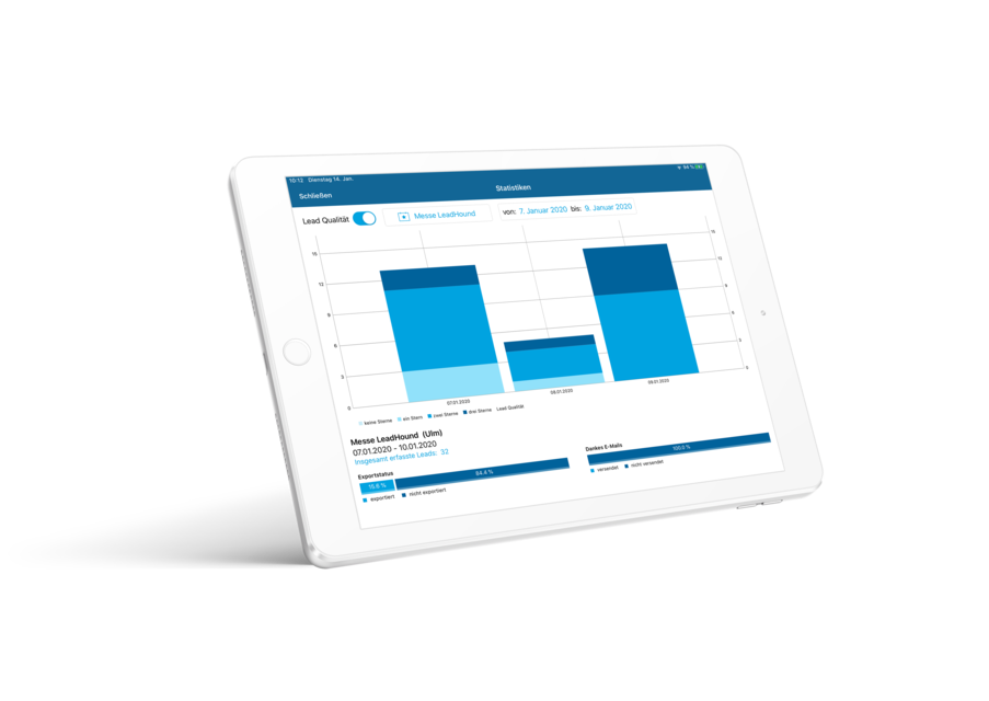
Lead Evaluation:
The main graphic reflects each day of the event with their recorded number of leads. As you can see in the picture, the data is shown as a bar chart, which makes it quite easy to compare the days with each other. In addition, you have the option of dividing each bar, according to the lead quality, by activating just one button. The area of leads rated with three stars has a darker colour than that with two stars, which in turn is darker than the amount with only one star. In this way you can see, how high-quality the event days were in detail, or in comparison to each other. You can also use the breakdown to interpret how many leads still require an intensive follow-up after the event.
Export Status:
The graphic of the export status provides information on the percentage of already imported leads. This makes it very easy to understand, whether and how many scanned business cards or leads have already been sent to your colleagues in the backoffice or have already been imported into your CRM- / ERP-system.
Thank you e-mail:
Next to the export status you can see another graphic with the same format. This graphic reflects the percentage of thank you e-mails sent in relation to the leads recorded. This gives you precise information about whether and how many of the leads recorded have received a thank-you email. From this you can see whether there are still leads, that have not received a follow-up mail, so you can take care of those afterwards.